UI Common Attributes
The following attributes are common to many user-interface related XForms elements.
appearance
Author-optional attribute to define an appearance hint. Allowed values: full, compact or minimal or a QNameButNotNCName.
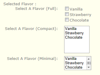
For example, when the appearance attribute is used on an xforms:select element, it might render as follows:
- full: all choices should be rendered at all times.
- compact: a fixed number of choices should be rendered, with scrolling facilities as needed.
- minimal: a minimum number of choices should be rendered, with a facility to temporarily render additional choices.
Example
| XML |
 Copy Code
|
|---|---|
<xforms:select ref="/icecream/flavor" appearance="full">
   <xforms:label>Select A Flavor (Full):</xforms:label>
   <xforms:choices>
      <xforms:item>
         <xforms:label>Vanilla</xforms:label>
         <xforms:value>v</xforms:value>
      </xforms:item>
      <xforms:item>
         <xforms:label>Strawberry</xforms:label>
         <xforms:value>s</xforms:value>
      </xforms:item>
      <xforms:item>
         <xforms:label>Chocolate</xforms:label>
         <xforms:value>c</xforms:value>
      </xforms:item>
   </xforms:choices>
</xforms:select>
|
|
The example below shows the way a select might be rendered on the client dependent on the appearance attribute.
class
Author-optional attribute which can be used to specify a list of strings that can be matched by css class selectors.
navindex
This author-optional attribute is a non-negative integer in the range of 0-32767 used to define the navigation sequence. This gives the author control over the sequence in which form controls are traversed.
accesskey
This author-optional attribute defines a shortcut for moving the input focus directly to a particular form control. The value of this is a single character which when pressed together with a platform specific modifier key (e.g., the alt key) results in the focus being set to this form control.
Specification
Link to XForms specification: UI Common Attributes.