Item rendering in SmartInstant 2.0
For maximum flexibility in page layout, SmartInstant 2.0 uses the 960 Grid System. This system divides the layout of a page into a grid of either 12 or 16 grid-columns. The rendering of a page is divided into rows. Each row contains up to 8 usable columns. Each row-column has a width of an integer number of grid-columns. These row-columns use Smartlets (and Smartlet Presets) to display the actual site content. Each row in the layout is represented by a Smartsite item with content type Grid Row or a content type that derives from Grid Row.
Step by step
Every content item (this does not apply to includes, images etc.) in SmartInstant is rendered by the same rendertemplate.
- The template calls
- System Translation {smartinstantgridlayout()}, which determines
- the Design to be used
This is the grandparent folder of the channel item. - the Default Layout
This is a folder of content type Row ContentType Layout called 'Default' in the folder called 'Layouts' in the current Design. - the specific Layout
This is a folder of content type Row ContentType Layout, in the 'Layouts' folder in the current Design that is- related to the current item through the Content Relation 'LAYOUTS', or if no such folder exists
- related to the current item's content type through the cross table siLayoutContenttypes.
- the Design to be used
- A basic html page is created.
- The next step is to render each type of Grid Row
- in this order:
- Breadcrumb Row
- Grid Row (one or more rows are allowed)
- Header Row
- Navigation Row
(Header and navigation are rendered after content as decreed by Webrichtlijnen and displayed before through the miracle of CSS) - Footer Row
- SmartInstant Grid Layout uses the {specialrow()} translation to check the Specific Layout folder for an item of the desired Grid Row content type. If no such item exists, it is taken from the Default Layout.
- For each grid row, the Logic field is rendered. Logic by default only contains the
- GridRowLogic translation which loops through all 8 possible columns and renders the Column# field for the ones that have a non-zero width.
- in this order:
- System Translation {smartinstantgridlayout()}, which determines
Here's an example:
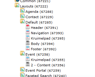
Items with content type Event will be rendered using the specific Layout Event (67258). In this case the Breadcrumb Row Kruimelpad (67355) and the Grid Row 2 - Content (67356) are used from the specific layout, Header, Navigation and Footer are taken from Default (67285).